Process Behind Our Menu Screen
Here's an updated menu screen with our newest art, aswell as it's design process and all of the menu screens we've created documenting our art journey.
It shows the end of your journey as the jelly, finally meeting his jellyfish friends in the sea.
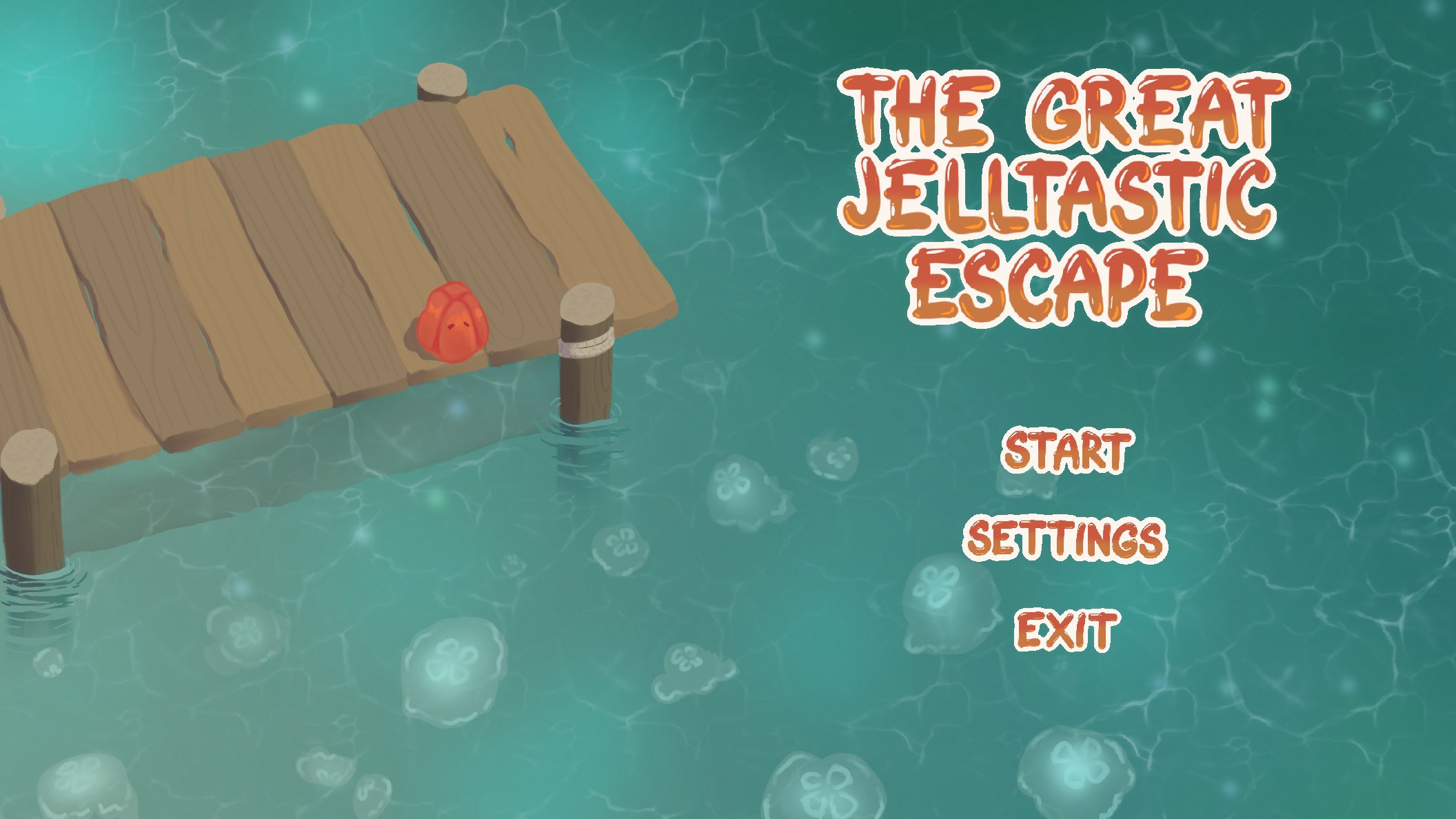
Here's the art process of our newest menu screen:
Added final details and effects like glow on the jellyfish, shadows on the jetty, water depth and sand and ripples.
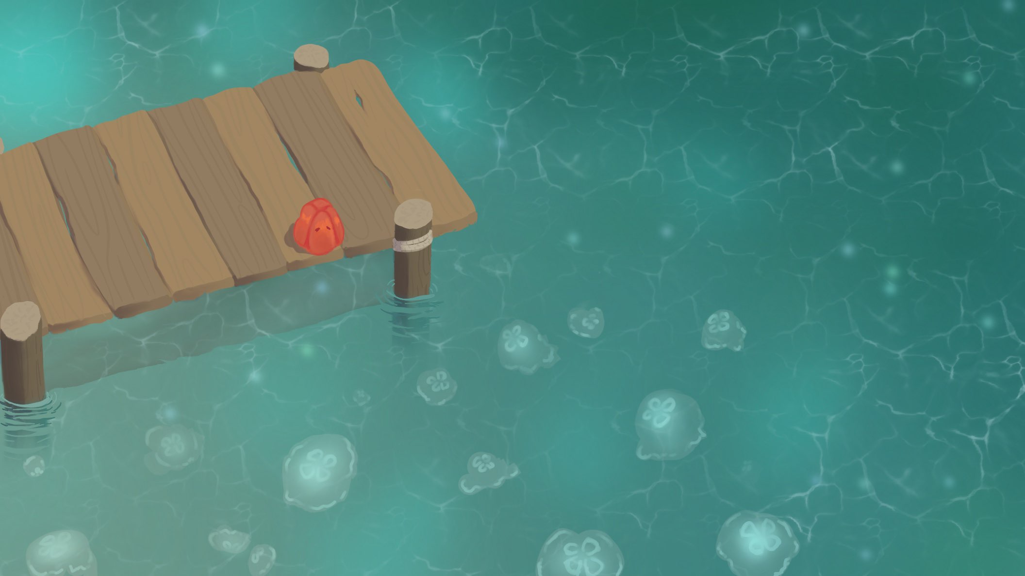
Here's the more rendered version with minor details.
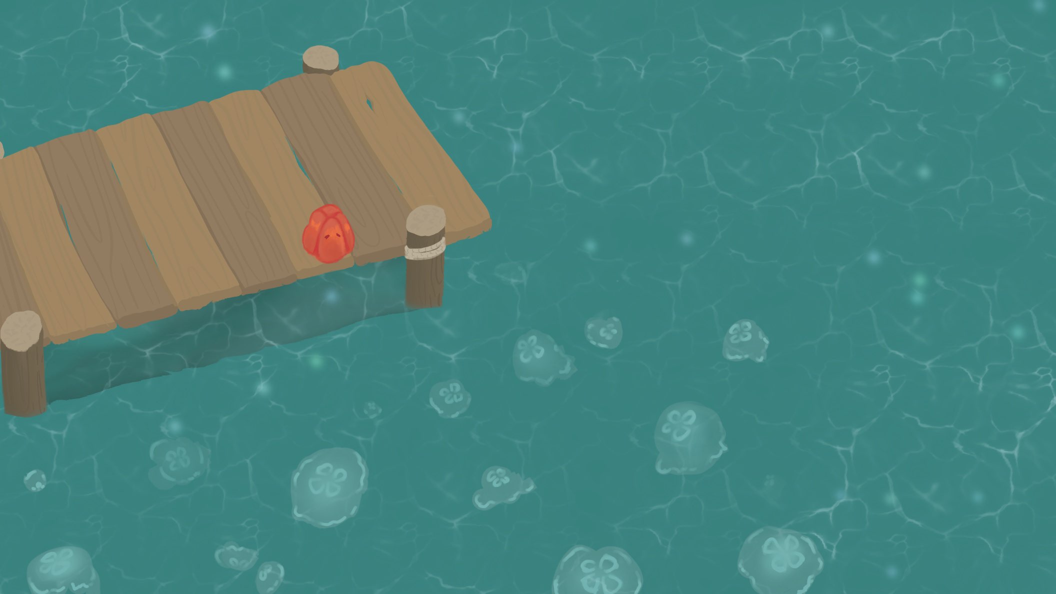
This is the colour block out stage and just experimenting what wood colour suits the environment and settling for a water style.
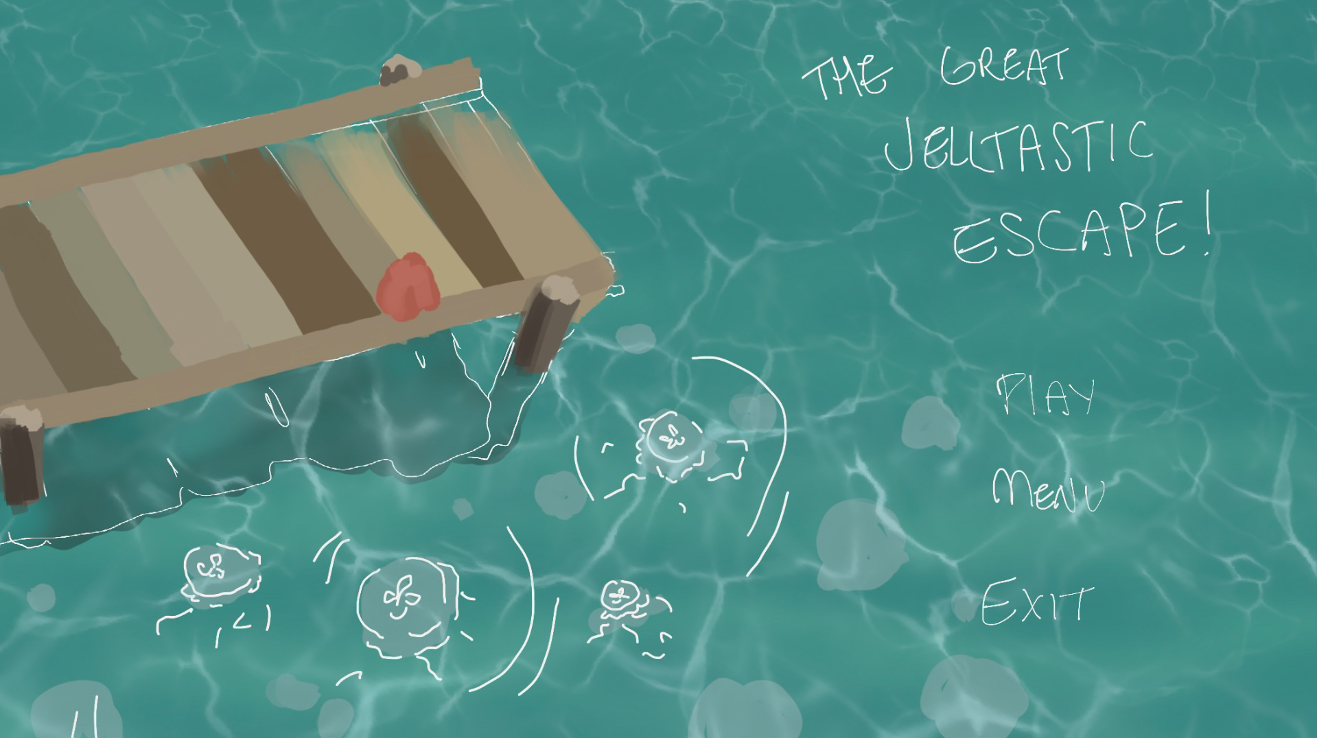
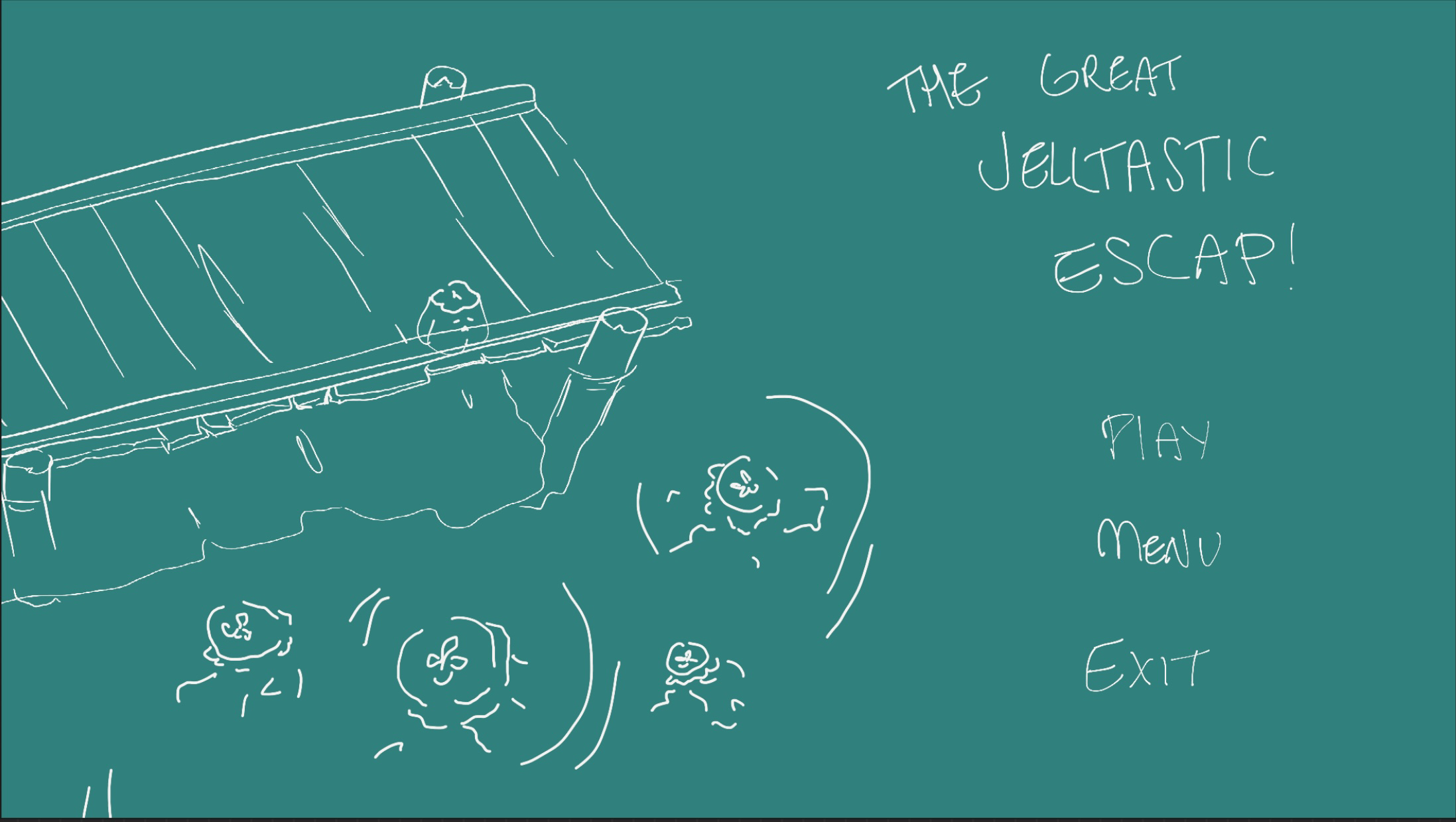
Initial sketch and layout of elements.
Our current menu screen and its redesign:
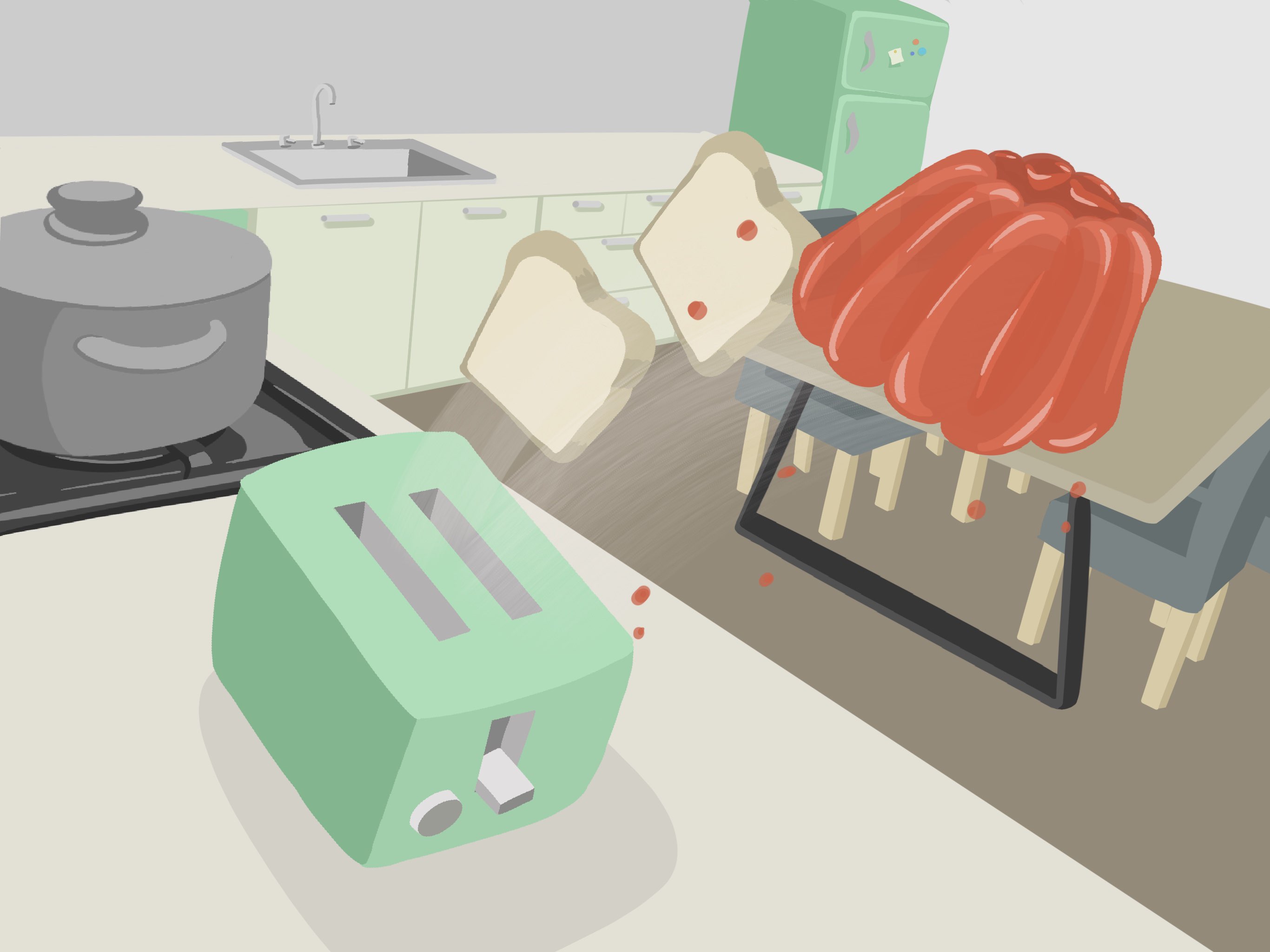
The current menu screen was of our original kitchen layout and using our first kitchen assets. We've improved all our models, art and style over the course of production and there for needed to update our menu screen since it's the first thing you see when opening up the game.
It's also really flat and pale Art wise. Menu wise however is really messy, crowded and there's too much going on visually that it's hard to see the UI.
Redesigned version:
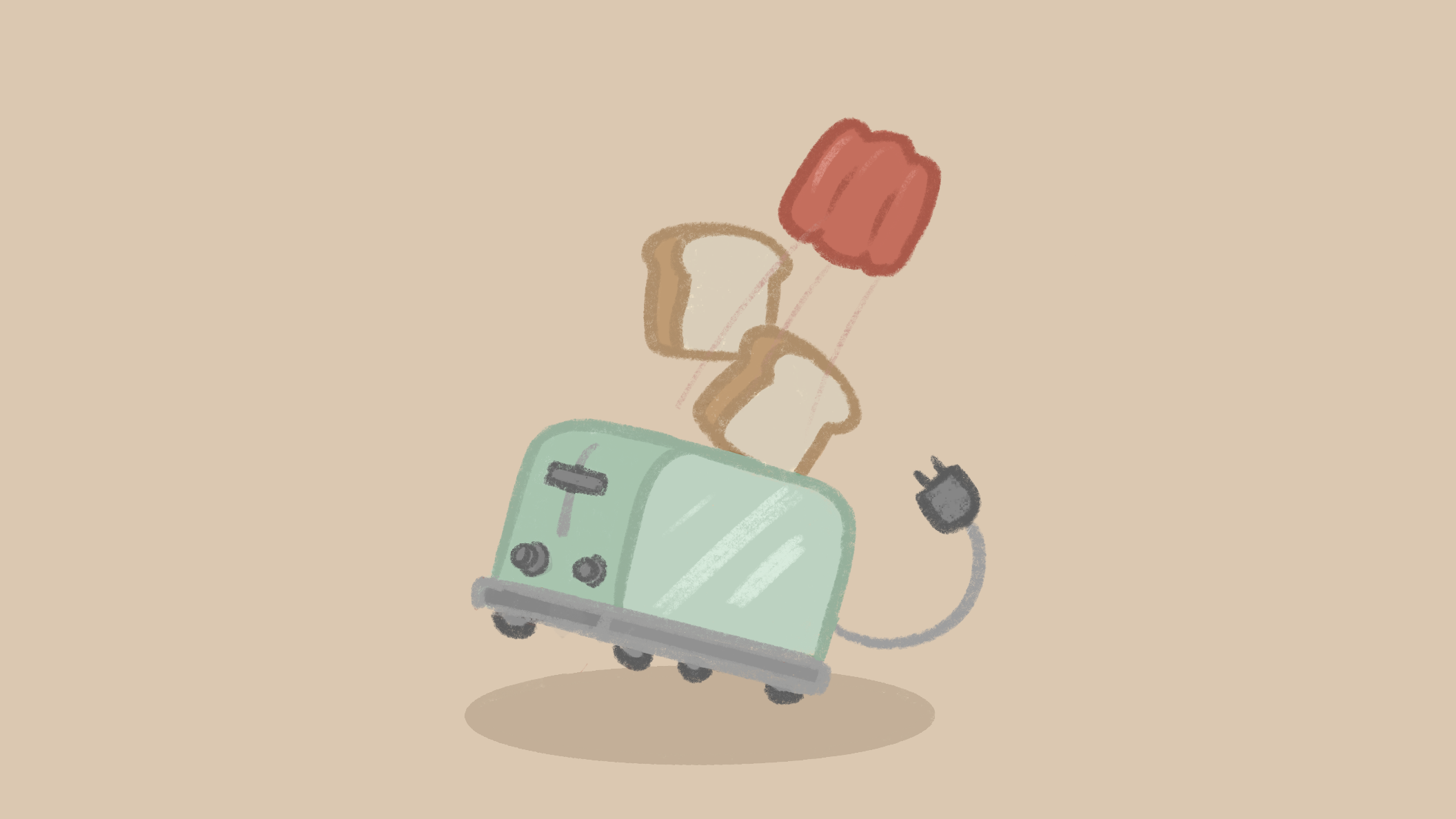
this version is simple and fun and allows a lot of space to put UI buttons without things getting crowded.
However didn't match the overall vibe and art style of the game and looks more like a thumbnail picture or loading screen image.
Get Jiggle Escape
Jiggle Escape
Jiggle your way to freedom!
| Status | In development |
| Authors | shuckwaffles, Jess, ULTIMATON, AngeloE28, Jonathan Dowse, Cathy_Car |
| Genre | Puzzle, Adventure |
| Tags | 3D, Casual, Cute, jelly, jiggle, Physics, Singleplayer, Unreal Engine |
More posts
- Behind the WallsNov 26, 2022
- Sewer UpdateNov 15, 2022
- Sneak Peak for Final LevelOct 21, 2022
- Particle Effects WorkOct 21, 2022
- Backyard UpdateOct 18, 2022
Comments
Log in with itch.io to leave a comment.
uh huh yep slayed